6 Data Representation and Visualization
6.1 Why is data representation and visualization an ethical concern?
If you’re looking at raw numbers and data points, interpreting trends can be very difficult, even after statistical analysis has been performed. It is for this reason that science has increasingly used graphs and figures (including photographs and videos) to visualize and communicate data. The way that data is represented and visualized can dramatically alter how the data is interpreted. Unfortunately, it relatively easy to deliberately mislead readers by altering visual representations to suit a specific narrative (Statistics how to, 2024). Inappropriately edited images, fraudulent images, truncated graphs, overly complicated visuals and overly simplified visuals are only a few ways that data can be unethically represented (Statistics how to, 2024; Owens, 2024). Misconduct and unethical practices have lasting impacts which can negatively influence both scientists and the public.
Ethical data visualization represents data in an honest, responsible and transparent manner and should be created in such a way as to accurately represent information without being misleading (Shahzad, 2024). Well visualized data makes complex data more comprehensible, is objective and without bias and is accessible to all readers (Shahzad, 2024; Crameri et al., 2020). It is vital that a scientist selects the appropriate type of visualization to represent their data. One of the most common reasons for poor data visualization is incorrect selection of the type of graph or chart. Not only can this alter the interpretation of the data, but it can impact legibility (Owens, 2024). Legibility is crucial. If the visualization is not legible, it has failed its purpose to communicate information. When considering legibility, it is important to ensure that it is inclusive. It must be accessible to those who are colour blind or otherwise visually impaired (Cipan, 2023). There are many suggested colour selections and palettes that have been created to improve accessibility and legibility for all readers (Crameri et al., 2020). Additionally, it is important to be culturally sensitive when selecting visuals. Carefully selecting the colours, symbols and language used in a visual can prevent causing offence to others. (Cipan, 2023).
When we read scientific content, what we are really reading is data that has been packaged in a way that is comprehensible so that we can quickly understand the culmination of hundreds of hours of complex work. When an author fails to adequately prepare visuals, they lose the opportunity to communicate and share the information that they have worked so hard to gather. In cases where a scientist is being deliberately unethical, their fraudulent information can permanently taint or influence whole fields of study, not to mention that they can damage their own reputation, that of their colleagues, waste resources and harm the already tenuous trust that exists between science and the public.
6.2 Example: Alzheimer’s study
In 2021, an investigation was initiated to determine if misconduct occurred in one of the most influential Alzheimer’s studies. The study was published in 2006 by Sylvain Lesné, examining the effects of Aβ amyloid buildup which is hypothesized to be the cause of Alzheimer’s. During the study, they identified a subtype of amyloid which they named Aβ*56. When isolated and injected in young rats Aβ*56 began to cause symptoms of dementia like failed recall. This was lauded as a huge advancement in Alzheimer’s research and the paper has since been cited over 2300 times (Mannie, 2022). Lesné prepared all the images for the paper, receiving a rare R01 grant and increased funding from the NIH to support his work (Piller, 2022). A neuroscientist named Matthew Schrag was asked to examine the paper in 2021 for alleged image manipulation. He found many instances of duplicated, cut or otherwise manipulated images in several papers written by Lesné. Additionally, there have been very few instances where other scientists have noted the presence of Aβ*56 (Piller, 2022). Moreover, as it is nearly impossible to purify an amyloid as they spontaneously convert to other types of amyloids, it is hard to say that Aβ*56 (if it exists) is responsible for cognition deficits. In the end, more than 20 of Lesné’s papers have been identified as suspect and Dr. Karen Ashe’s (their mentor) reputation has come into question as a result, though no misconduct has been identified on her part (Piller, 2022).
This example of image manipulation for the purposes of fraud illustrates how impactful an unethical scientist can be. Lesné’s misconduct has damaged his reputation as well as that of his mentor and colleagues. Furthermore, because of the alleged promising discovery, funding for Alzheimer’s research has been funnelled into similar studies and experiments largely ignoring other avenues of inquiry. These fraudulent studies have misdirected Alzheimer’s research for nearly 16 years (Mannie, 2022; Piller, 2022). This news must have been devastating for all who were waiting and hoping for an effective treatment and has likely eroded their trust in future discoveries and advancements.
6.3 Practice Questions
- Editing images
You are in the process of publishing a paper about the effects of a protein called “Ethicin“ on DNA synthesis. As a part of your work, you have run several polyacrylamide gels and intend to include them in your paper submission. In the below image, panel A is the unedited, original image of the gel. Panel B shows the gels after you have edited the images to improve clarity. 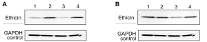 [1]
[1]
2. Clarity and inclusivity
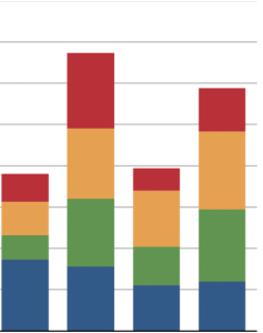
You have performed a study analyzing the nutrient content in a variety of plant species with the goal of determining which plants might be beneficial to counteract certain types of nutrient deficiencies. To communicate this information, you choose to use a stacked colour bar graph.
3. Image editing
Images can be an excellent way to share information, but it must be done ethically. With the increased accessibility and availability of digital editing tools, image editing is easier than ever for authors. Inappropriate image manipulation using software such as Photoshop has caused journals to implement image analysis to detect unethical image manipulation. However, not all image manipulation is inappropriate or unethical.
4. Data representation
You have been analyzing your data from a recent experiment studying the effects of different cleaners on common bacteria. You notice that you have two outliers that do not follow the other data trends. When you create a graph, the data points for the outliers are so different from the others that they force you to change the scale of the graph. Since the data for these outliers is not significant and it impedes the legibility of the graph you decide to omit them from the graphs. 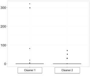 [5]
[5]
- Figure adapted from the NIH – Research cases for use by the NIH community. 2014. Theme 14: Differentiating between honest discourse and research misconduct and introduction to enhancing reproducibility. Case Study 1: Handling of Images and Graphs. ↵
- Stacked bar chart image adapted from: "Chart of Unaccompanied Minors Apprehended by USBP, 2014-2019" by Carwil is marked with CC0 1.0. ↵
- Pie chart adapted from: https://commons.wikimedia.org/wiki/File:H1b_demographics_pie_chart.svg ↵
- Grouped bar chart adapted under Creative Commons Attribution-Share Alike 4.0 from: https://commons.wikimedia.org/wiki/File:Matplotlib_bar_sample.svg ↵
- Original unedited image from: C.A. (2015). How to present box plot with an extreme outlier. Stack Exchange. https://stats.stackexchange.com/questions/114744/how-to-present-box-plot-with-an-extreme-outlier ↵
